The Bird Animation by deVOL
16th October 2017
From the outside, deVOL’s countryside headquarters feels undoubtedly quiet and serene, but step inside and you’ll discover quite the opposite.
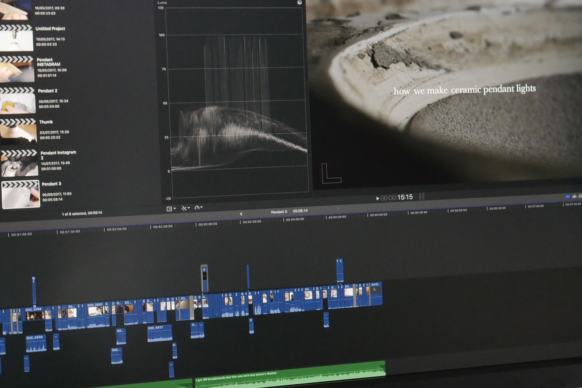
From makers of luxurious interior furniture, handmade ceramics and metalware to the creators of our beautiful photographs, simple graphics and product development, Cotes Mill is a bustling place of innovation and design. With so much happening we were eager to start showing people some of the cool things that our designers get up to. We thought that one of the best ways to do this would be to create a series of short films – titled We Make.
So that’s exactly what we did! Before long we were getting thousands of views and wonderful comments from people all over the world, but true to deVOL, we knew that we could make our films even more beautiful.
We started to think about how top film production companies often create short animations either at the start or end of a film to elevate their brand. One in particular that stood out belonged to a company called Scott Free Productions; produced by an Italian animator called Gianluigi Toccafondo, it just seemed so creative and visually striking.
We decided that it would be really cool if we could develop our own short animation to play at the end of all of our new films. Huw, Polly (our lovely and extremely talented design intern for the summer) and I were pretty much completely clueless about how to make an animation like this, but we wanted to give it a go and it was exciting to start on a new creative challenge.
With such little knowledge, we thought that the best place to start would be to carry out some research (lots of YouTube tutorials). We began sketching out a few ideas, looking closely at the deVOL logo and thinking about key things that could work really well with our whole ethos – bearing in mind that we only had about 6 or 7 seconds to play with!
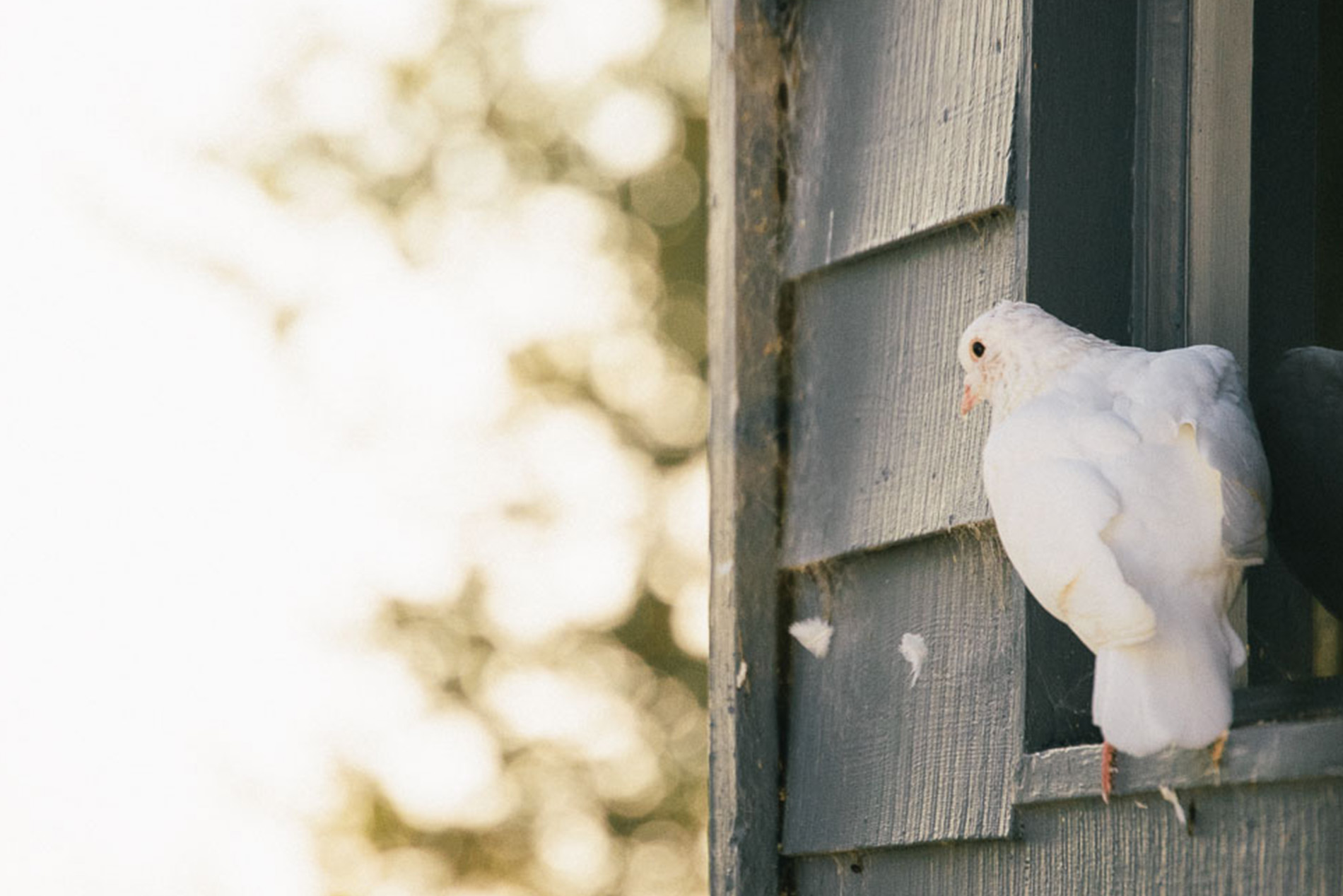
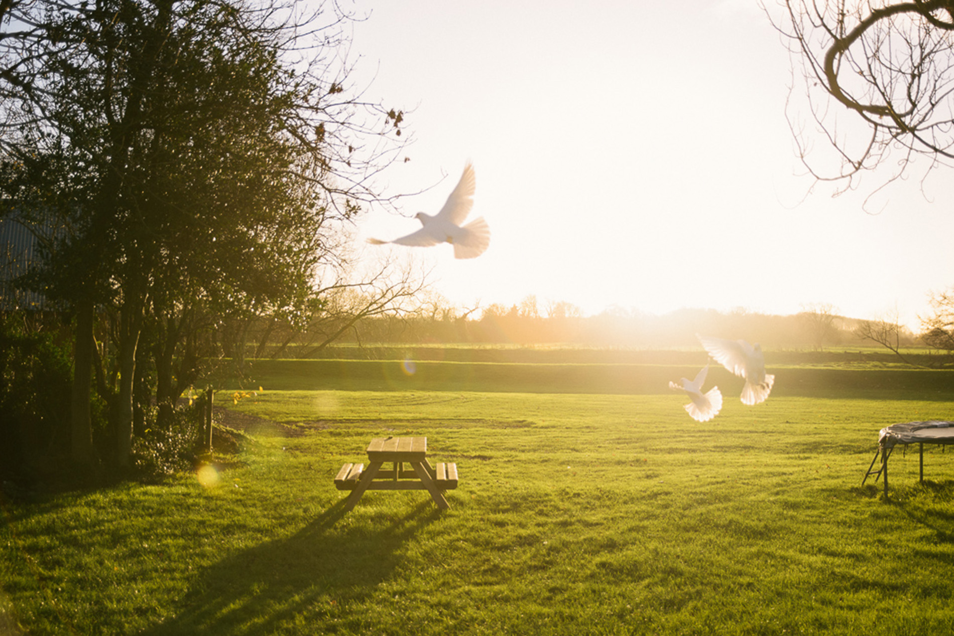
We knew that the animation had to reflect deVOL’s ethos. Therefore, we didn’t want the animation to be too over the top, too bold or too flashy. Instead, we wanted it to be charming, simple and of course beautiful. We thought about depicting something from our workshops, something craft based, or maybe taking inspiration from the wildlife and birds at the mill. We have so many lovely animals here at Cotes Mill; they are a big part of what makes Cotes Mill such a delightful place to visit. Our resident doves, both graceful and beautiful, are just one of the animals that seemed to capture this idea really well. Once we had the image of a dove in mind, it was just a matter of figuring out how it could interact with the logo in a meaningful but delicate way.
If you’re familiar with our logo then you’ll notice that the letter ‘O’ in deVOL is positioned at a slight angle, making it quite a unique feature; we thought that this could be a solid place to start building some ideas from. Maybe we could design the dove to move the ‘O’ in some way… maybe the letter could start off at a regular angle, with the dove perched on top, and as it flies away it could move the letter into its rightful position. Yes! That idea seemed really popular amongst the team so we grabbed our notebooks and pencils and spent a good while sketching out how it could look.
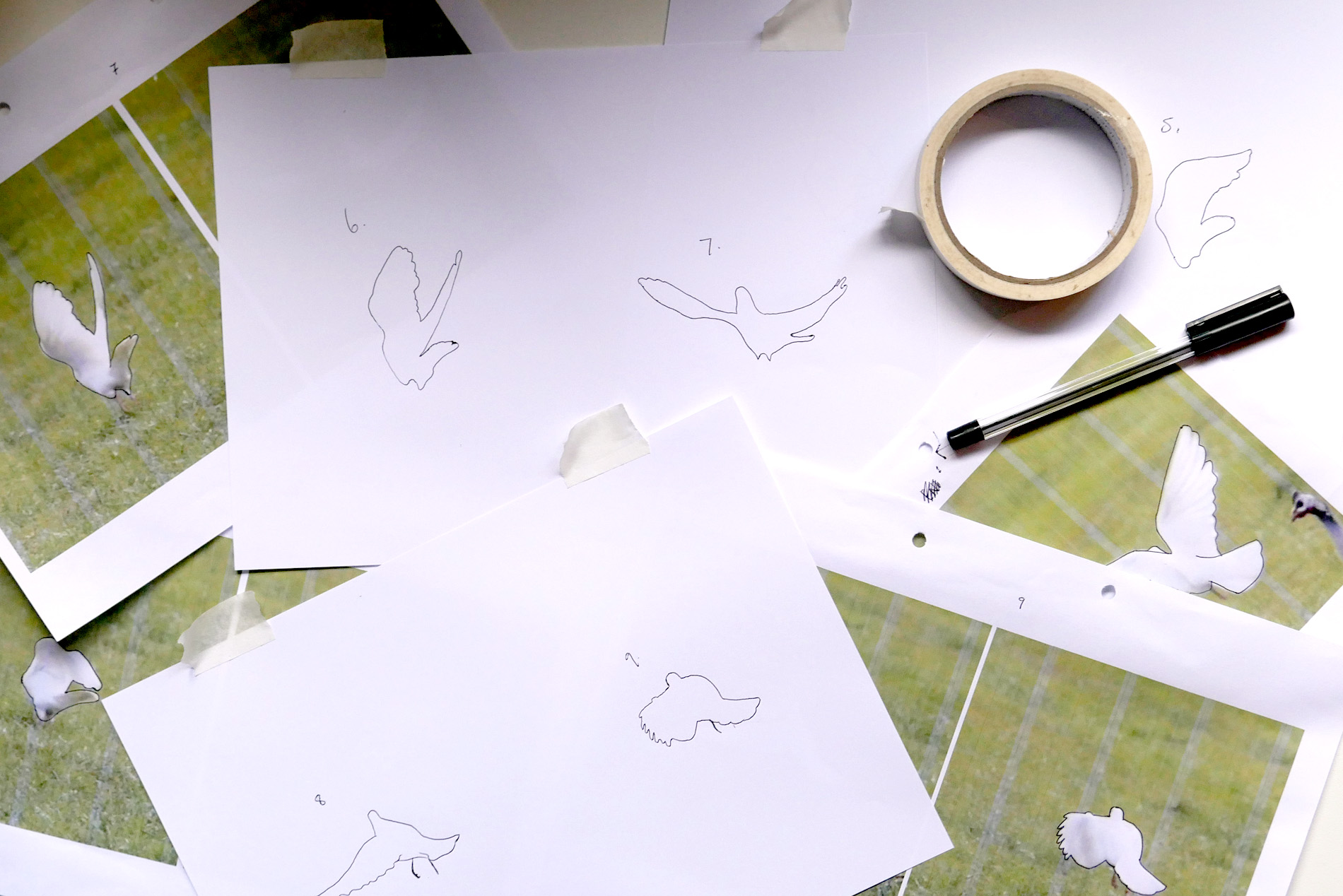
We realised very quickly that we needed to study the movement of our doves in order to make it look right. With a little help from our photographer Tim, we were able to capture a short clip of a dove in flight. We then used this footage as a basis for our drawings.
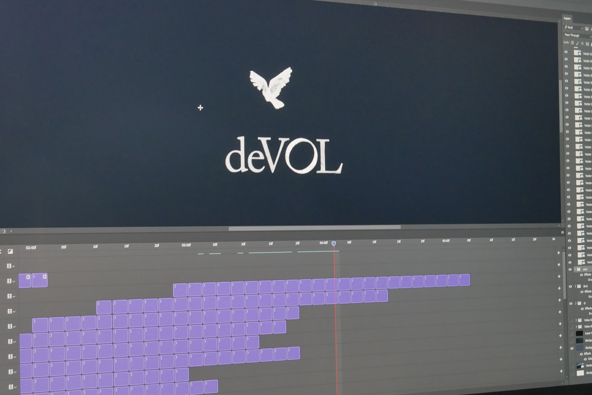
The animation started as a basic line drawing. We drew each individual frame out, scanned them into the computer and dropped them into a timeline in Photoshop. We ended up with about 60 separate drawings, which simulated the flight of a dove when played in succession. The result was a simple hand-drawn animation that successfully captured the essence of our idea. But it was a little too simple, and unfortunately, the dove looked like any other bird. We needed to develop our animation further and to do that we had to experiment! We gathered all of our pens, pencils, and paints and started exploring ways that we could add more character and depth to the animation.
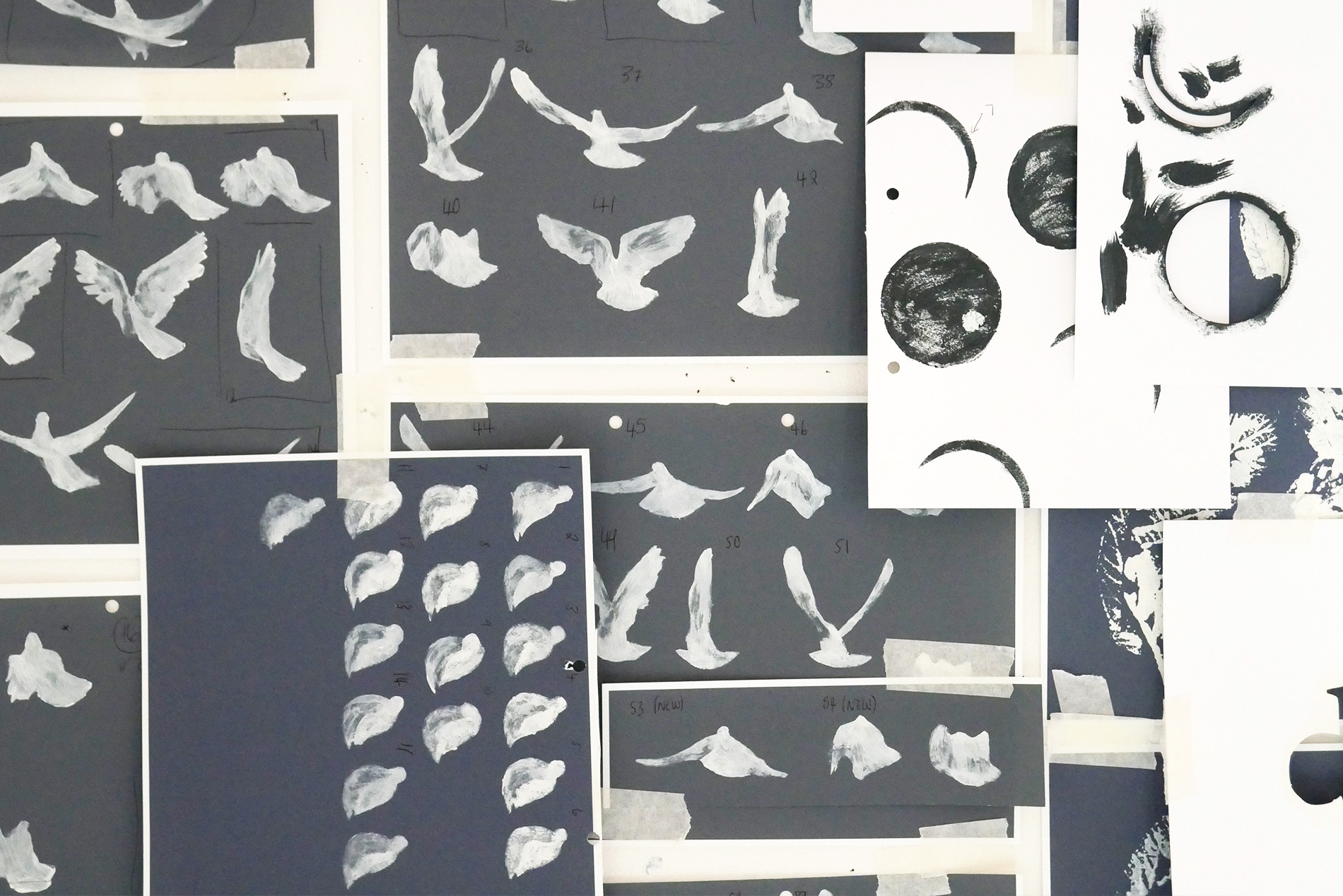
We tried all sorts, but the most successful experiment was painting with our Pantry Blue Shaker colour and using a dry brush; focusing on the texture and shadows of the dove. This seemed to work well but we found that with the freestyle painting we were losing the shape of the bird. And so we decided to make our own stencils. Using a stencil meant that we could keep the shape of the dove as close to the image as possible, allowing us to put all of our focus into the textures and shadows.
We stuck our paintings up on the wall and all took a big step back…. It still didn’t look like a dove, why? It was pretty obvious actually; we were using our dark Pantry Blue colour on a white background, making the dove look more like a blackbird. Instead, what we needed to be doing was the opposite, using white on a Pantry Blue background!
Now that we had a good idea of how the animation would work and how our dove would look we were ready to begin producing each stencil (including stencils for the logo) applying paint and scanning each one in. With all the artwork scanned in we dropped everything into Photoshop again, experimenting with the position of the bird on the page, the speed at which it would fly and how it interacted with the logo.
Before long we had our animated bird and logo, it wasn’t perfect but we were very happy with what we had accomplished. We also spent a long time trying out different ways of making the background appear more dynamic and connected to the painted bird, however, most of them ended up being a bit of a distraction so we kept it nice and simple. The finishing touches were printing some leaves from the grounds onto paper and placing them into the animation so that it looked like they were tumbling across the screen in a gust of wind. You can see a video below which shows off some of our working versions of the animation and how it developed over time.
We hope you’ve enjoyed viewing our short animation and that it shows you how deVOL is much more than just a furniture company. If you would like to view our collection of We Make videos, check them out here!

