Photographing a little green deVOL Kitchen in Paddington
18th March 2020
On a very chilly day in January, Letty and I hopped on the train at Farringdon, camera bags and tripods and phones and a few props in hand, and set off for Paddington. We arrived at the front door of a classic London townhouse, were greeted by the loveliest customer and led up the stairs to a little 900 square foot flat. It was small but wow was it gorgeous and it had been totally redone, top to bottom, absolutely impeccably. Even more proof that you don’t need crazy amounts of space to create truly beautiful interiors.
I’m going to show you a few snaps of the deVOL Kitchen but please follow along with @900_sq_foot for more photos of this place, as well as some very satisfying before and after shots… I can’t believe what this kitchen used to look like!!!
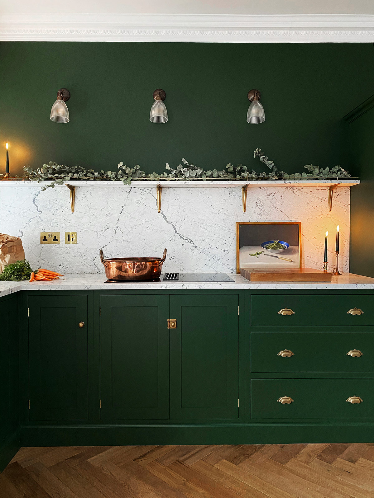
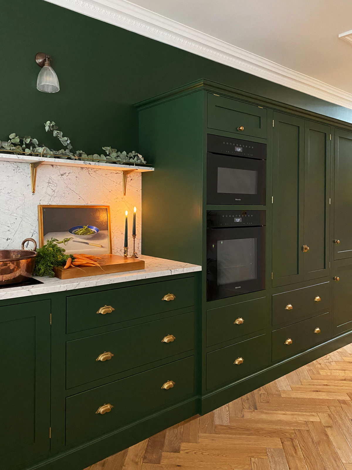
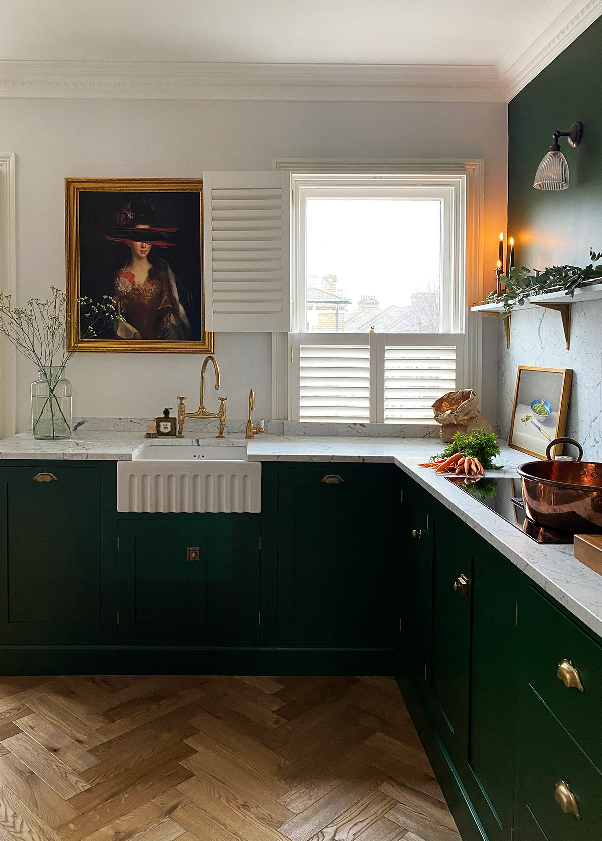
How gorgeous is this? A little reminiscent of our iconic Peckham Rye project with its rich colour and expanses of bold marble and brass but new and exciting all in its own way. This kitchen is made up completely with our standard sized Shaker furniture, the only thing we slightly altered was the internals of the 900mm double door cupboard housing the hob, just to make room for a handy downdraft extractor below. It makes us so happy to see that you don’t always need bespoke sized pieces to create the look of a bespoke kitchen. Sticking to standard sized cupboards is also the most economical way to design, so if you’re sticking to a specific or smaller budget, there is no better option.
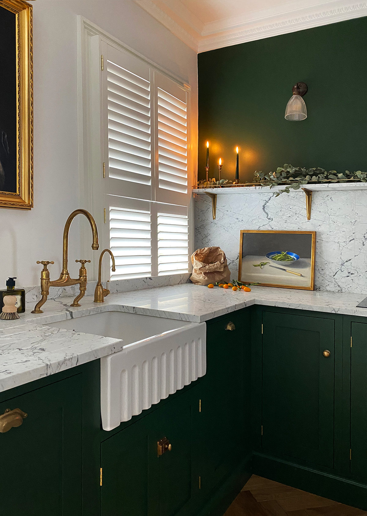
These customers made spot on choices with the accessories, we especially love seeing one of our deVOL 600 Fluted sinks, the perfect size for a smaller kitchen. The ribbed front is that little extra detail that makes you want to stop and have a feel of the smoothly glazed bumps. No sink area is complete without one of our aged brass taps!! Here you can see the ‘Ionian‘ style paired with a very handy instant hot water tap in the same finish – the kind of thing you might ummmm and ahhh about because yep it’s a luxury but it’s one of those luxuries that’ll probably end up turning into a necessity.
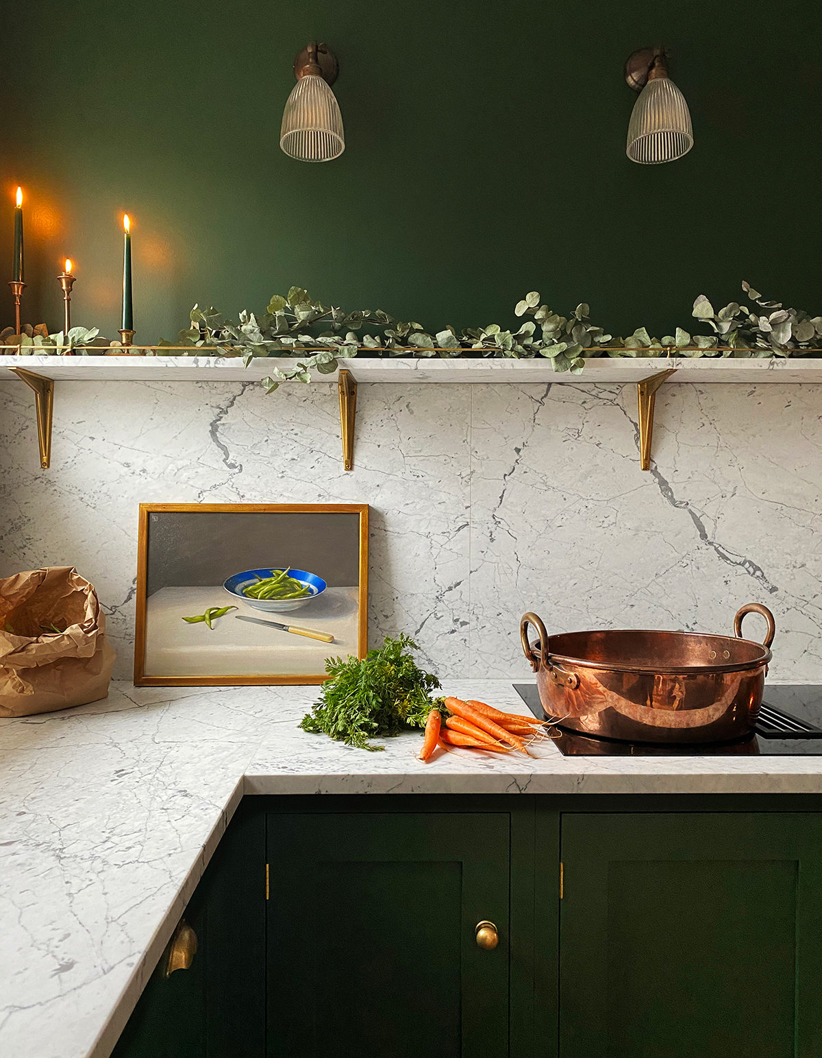
Now let’s talk about these worktops! When the customers first started imagining their new kitchen they were pretty adamant that the cupboards would be black and the worktops would be dramatic San Simone quartzite, but at the very last moment they changed their minds and went for this incredible bespoke deep green paint colour with honed Statuarietto marble. Either combo would have been a showstopper but I’m very happy this was the winner! Honed marble is a bit of a scary one for lots of people as it has a reputation of scratching and marking and staining, we go into plenty of detail about this in our marble worktop blog, but to cut a long story short, it’s never as bad as you think it’s going to be!! If you love natural then go for it, you won’t be disappointed.
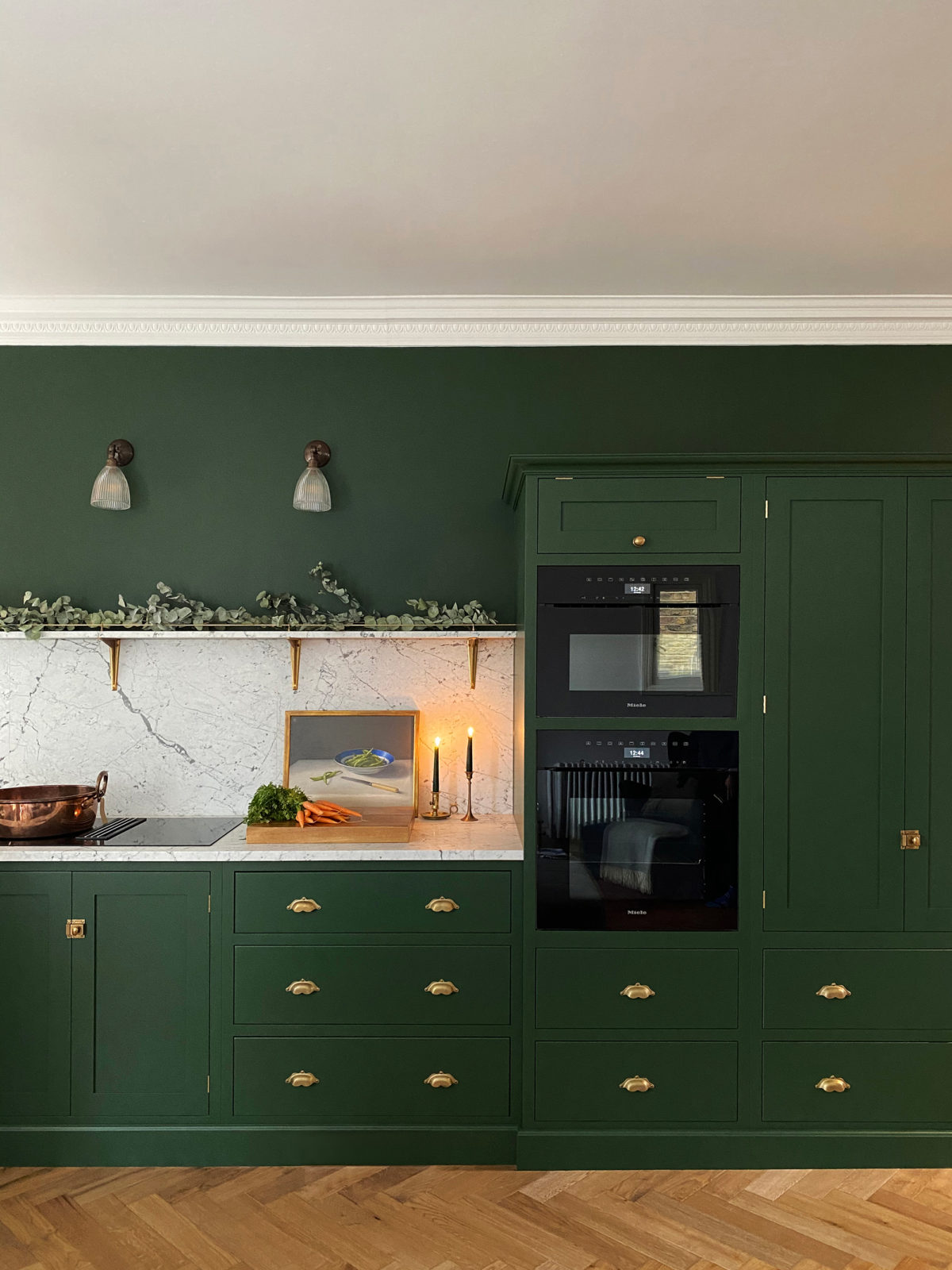
I had to show you a close up of the aged brass ‘Boho’ handles, a little fancier and prettier than the plain cup handle style, these ones are my favourite, they look like little moustaches!! The shelf brackets are by deVOL too, so sturdy and classic, and we also made a very special gallery rail in the same brass to top the marble shelf. Perfection.
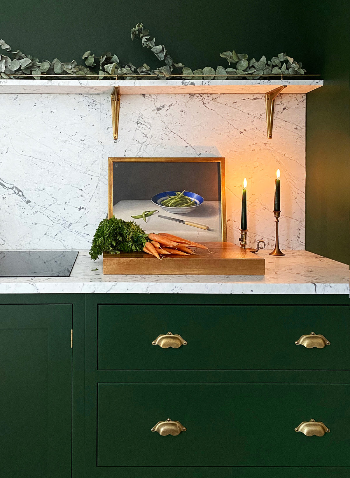
And this was one cool bank of storage. The flat had really high ceilings but not so much floor space so it made absolute sense to build up. Double stacked Miele ovens, a large pantry cupboard for food with drawers below and on the end, an integrated fridge and freezer. If you’re going for a simple, uncluttered kind of kitchen, then integrating your appliances is the way to go.
And finally a little look from another angle. To the left of this shot was a lovely big sofa and a dining table too, this was proper open plan living and was done so well. It’s never about having loads of space, huge rooms and gardens and houses, it’s about using the space you do have wisely and coming up with something that’s comfortable and easy to be in. For me this open plan living is the dream scenario, one big space to enjoy everything from prepping and cooking to eating and chatting and laughing and snuggling down on the sofa to watch a movie with your family and your friends.
Well, I hope these new photos were a nice a little distraction today and you are feeling inspired, especially if you’re working with a small space. Don’t forget to keep sending us photos of your deVOL Kitchens, we’re always sooo happy to receive them and are always on the lookout for special kitchens to photograph.
– Don’t forget to follow @900_sq_foot for more updates on this gorgeous place.
– Take a look at more Shaker Kitchen projects on our website here.
– Find all our contact details here if you’d like to discuss an upcoming project, we can’t wait to hear from you.

