deVOL directory: A Kitchen in Hove
5th September 2018
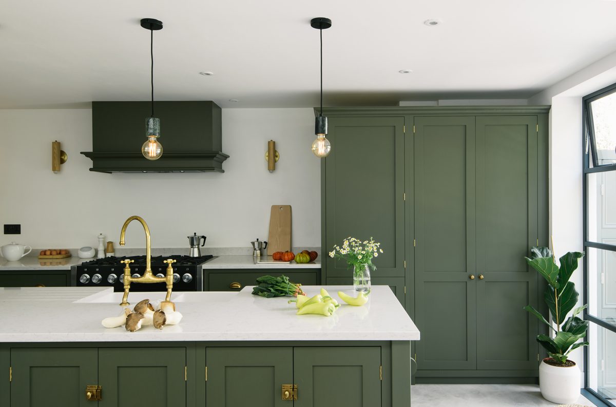
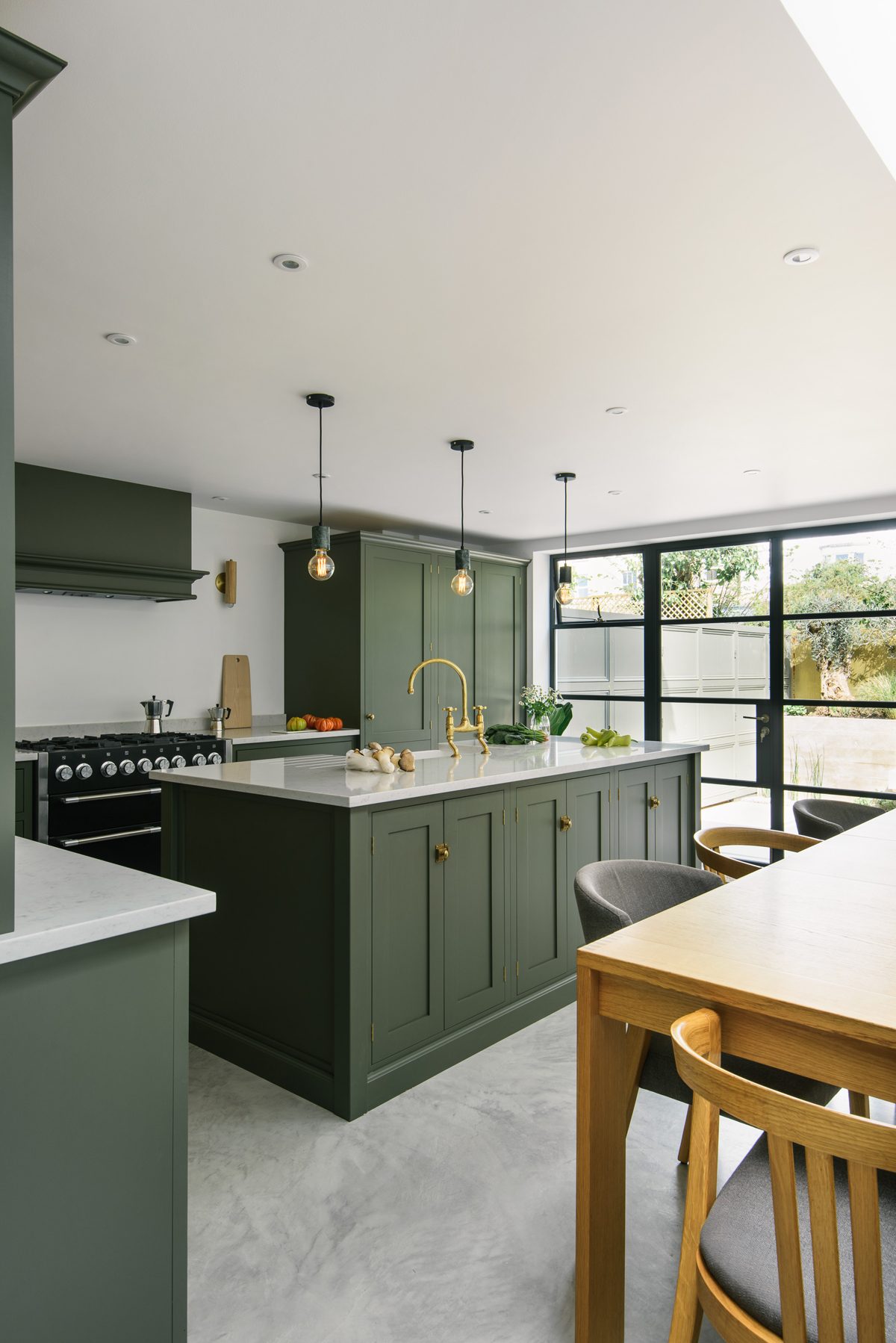
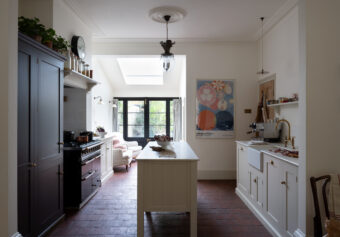
The owners of this pretty Victorian terrace in Hove made a very wise decision to extend the back of their property, turning a small dark and not so lovely room into a large family space full of light and a deVOL Kitchen that is as cool as can be.
We’ve answered lots of questions about this kitchen over on our Instagram page – please do always feel free to send your questions over to us on social media, we love chatting to you and helping anywhere we can. But I think it is always handy to have all of the information on a particular project in one easy place – and that’s where these kitchen directories come in, so here goes!! The cupboards are from our Real Shaker Kitchen range and here’s a little info on the rest…
1. The Paint Colours & Hardware
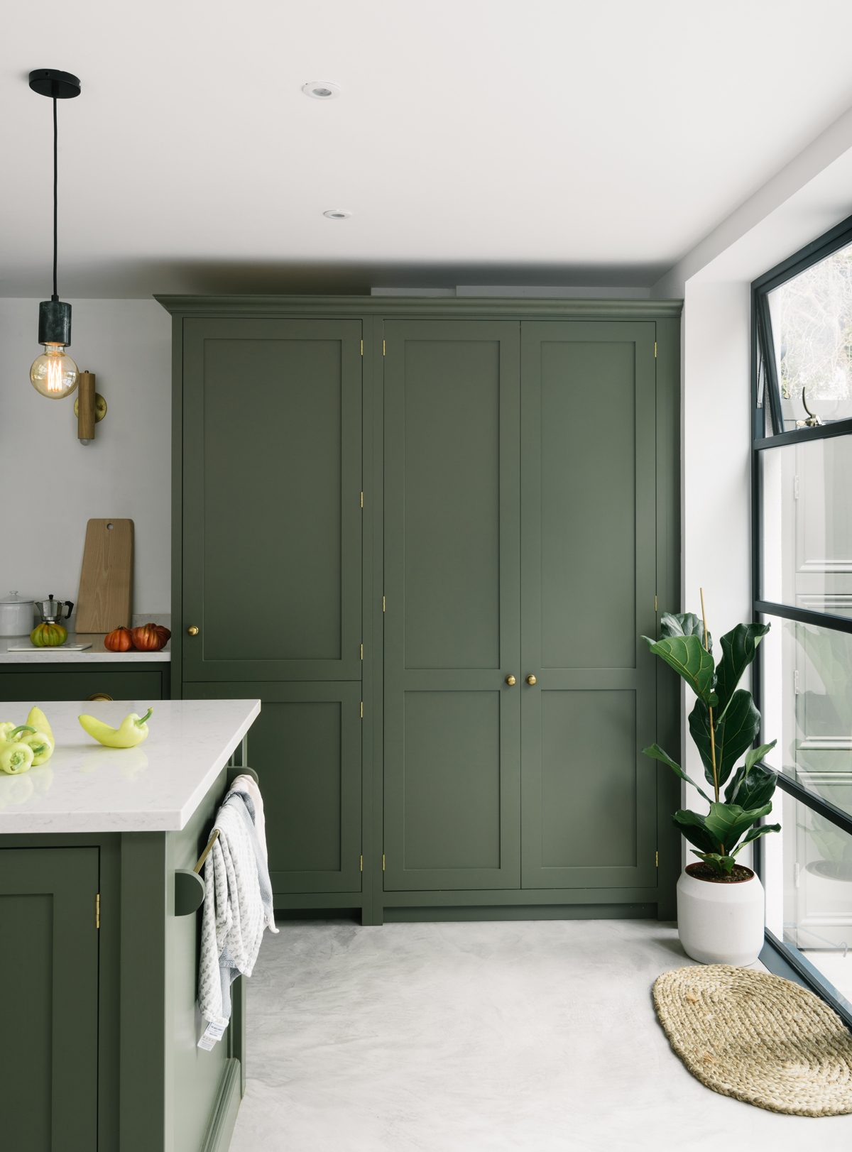
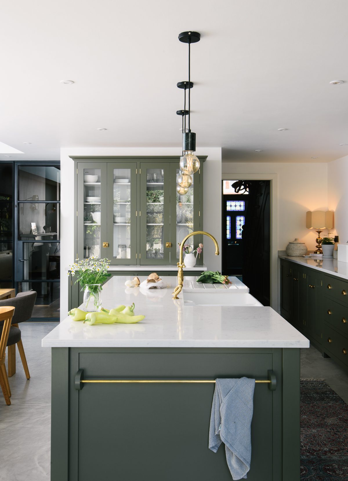
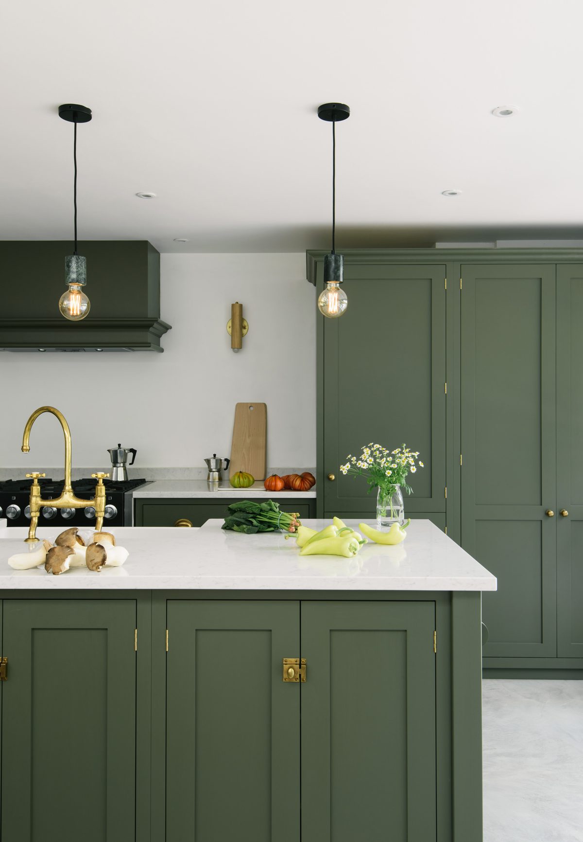
It’s exciting when our customers pick a colour that we have never seen on our cupboards before!! Of course we love our range of deVOL paint colours very much, they’re perfect and they’re timeless, but it is rather cool to see a Shaker Kitchen painted in this dark olive green. It looks so smart and I really adore it. It’s a bespoke colour which means we can’t give you a shade name but do remember that we can match and paint your Shaker Kitchen to any colour you would like, this will cost a little more than if you go for one of our 12 Shaker colours but what a great way to make your kitchen extra personal. The cupboard catches, knobs and cup handles here are from our Bella Brass range. We like to keep some things just for our kitchen customers, so the Bella Brass range isn’t available to purchase separately – but our handcrafted deVOL hardware is and I think you’ll really love it…
– deVOL Handcrafted Hardware – www.devolkitchens.co.uk
2. The sink & Tap
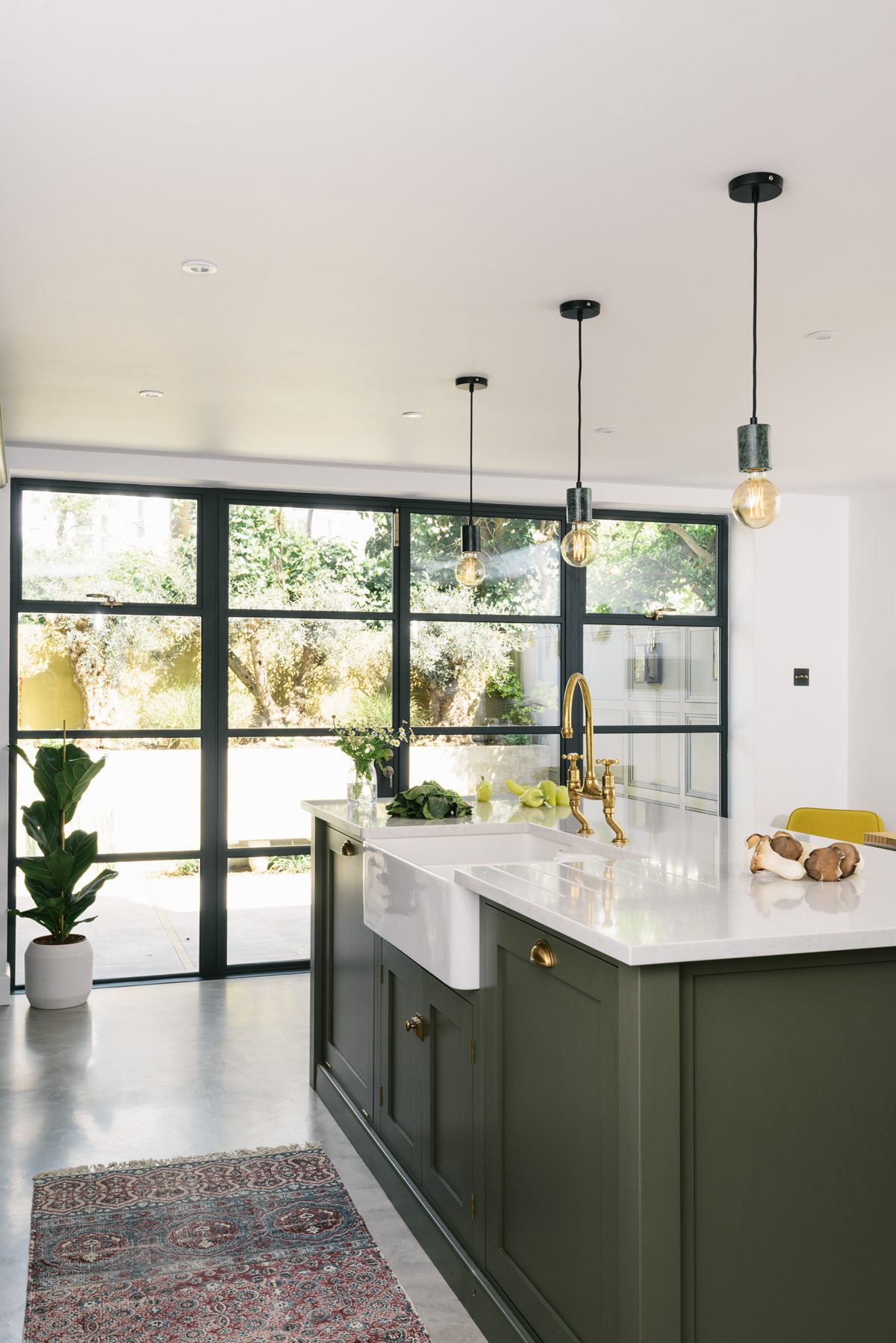
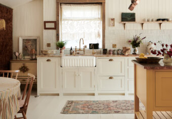
To match the hardware the customers had one of our iconic deVOL Aged Brass ‘Ionian’ taps, made in collaboration with Perrin & Rowe. I may be a tiny bit biased, but I think our exclusive brass finish is as good as it gets… if you can’t find a pair of vintage taps in good working order (we know the struggle!!) then our Aged Brass collection is for you. The sink is a Villeroy & Boch ‘Farmhouse 80’ and there’s an integrated dishwasher just to the right of it. It’s a great idea to have your dishwasher next to your sink, you can rinse plates and mugs and easily pop them out of sight to be cleaned later. It’s amazing how good design can make everything a little less stressful and a little more fun.
– The tap – www.devolkitchens.co.uk – The sink – www.devolkitchens.co.uk
3. The Flooring
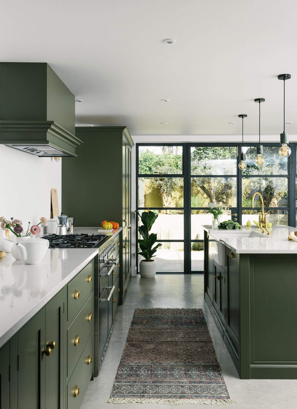
The Hove Kitchen had an exceptionally well finished Pandomo concrete floor. Subtle little swirls, ever so slight variations in tone and a smooth polished finish. A hardwearing material that will take a great deal of use and wear and tear and an impeccable choice for this contemporary kitchen. And there’s the rug… we were chatting about this on our Instagram the other day – isn’t it nice to have a rug or a little sofa or armchair with a few squishy cushions in your kitchen!? Yes a kitchen can be a busy and a messy place, but we love the idea that soft textiles can make a kitchen look and feel a little less kitcheny.
– The rug – www.frenchconnection.com – More info on Pandomo surfaces – www.ardex-pandomo.com
4. The Worktops
The worktops are ‘Lagoon’ Silestone – probably the most popular choice for our customers who want the look of marble, but don’t actually want marble!! All work surfaces have their pros and their cons, but sometimes you just want something you don’t really have to worry too much about. Silestone worktops are man-made from 90% natural quartz, they’re highly resistant to scratches stains and acids and have antibacterial properties too. That’s one of our beautiful and brand new deVOL Hanging Rails on the end of the island too, a little added sparkle and the perfect spot to hang tea towels and linens.
– We only supply and fit worktops as part of a deVOL Kitchen – The deVOL Hanging Rail – www.devolkitchens.co.uk
5. The Lighting
We have said this before but lighting is a really important part of your new kitchen and picking it can be really difficult. A beautiful big statement light or old chandelier can look so fabulous but if in doubt, keeping it simple always looks good and the owners of the Hove Kitchen did just that. Cool round filament bulbs on black wire hanging above the island were just enough along with a couple of Workstead wall lights either side of the cooker for an extra glow.
– The wall lights – www.workstead.com – Lights above the island – www.heals.com
6. The Range Cooker
This gas top range is by Mercury, solid and sensible and great for keen cooks, not to mention the fact they look so good. Black was a smart choice with the green and the chrome detailing is a nice change from brass, it keeps the room feeling a bit more organic and not too matchy-matchy. We supply Mercury range cookers and can deliver them alongside your new deVOL Kitchen.
And I think that’s all the main bits covered!! Writing this blog has made me love this kitchen a little bit more than I did before, the layout is functional, there’s oodles of storage, places to sit and places to perch and the mix of modern and traditional styling is perfection. Even sacrificing a little garden space to build this extension was so worth it, the big floor to ceiling Crittall-style doors link the kitchen and garden in a way that makes them feel like one. A fun, bright and warm space that people want to hang out and just spend time in. That sounds like a perfect kitchen to me.
– Take a look at the full Hove Kitchen project here.
– Keep up with everything deVOL on our social media: Instagram, Twitter, Facebook & Pinterest.

