Designing The St Oak Apartment Kitchen
3rd July 2024
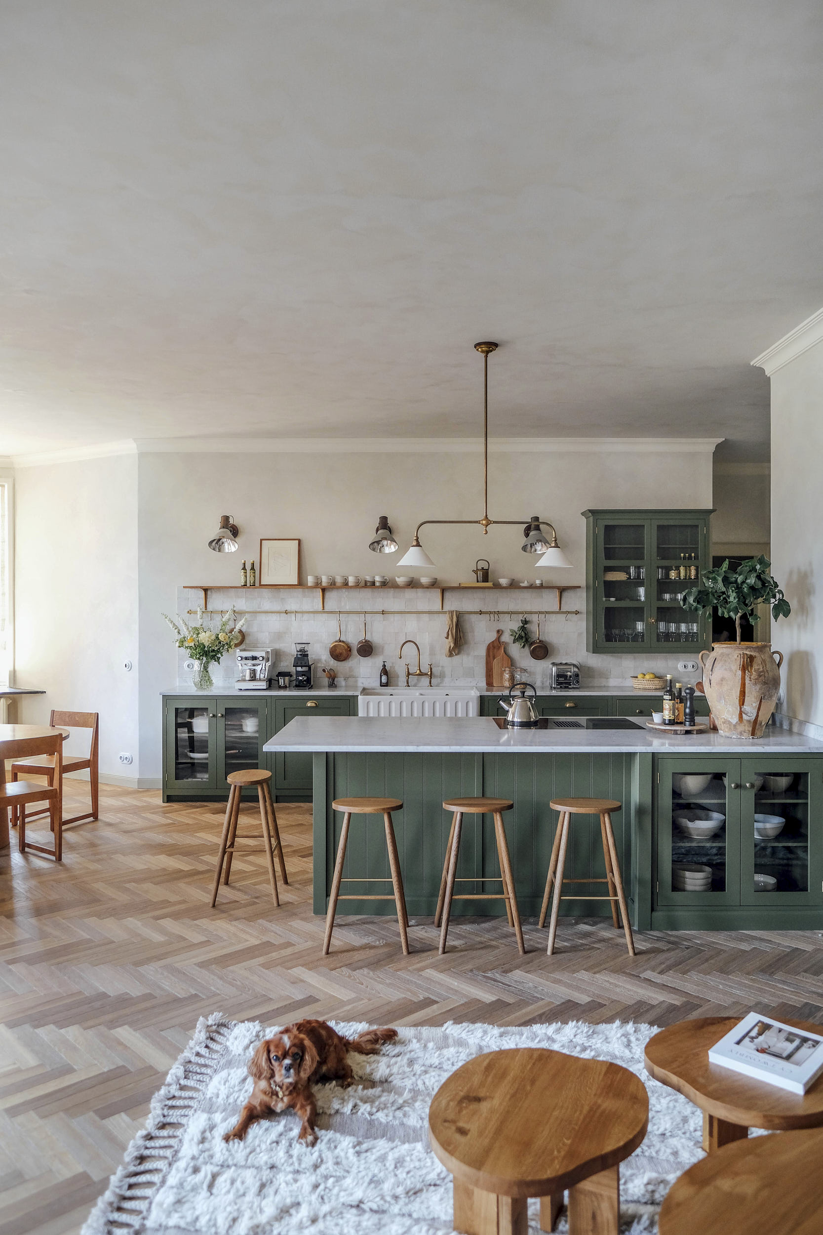
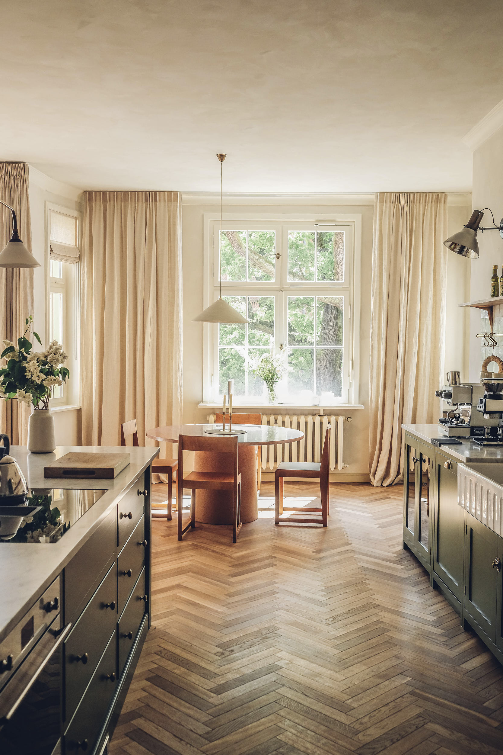
We recently completed our fourth kitchen with the duo behind Our Food Stories, the lovely Laura and Nora. This time it’s a rather wonderful Shaker design for their rental property, St Oak Apartments, in Kyritz, Germany. Open, airy, inviting, it’s just the place I’d dream of staying on holiday.
Beautiful styling & photography by St Oak Apartments.
I find myself going back to the images time and time again, taking in each little detail and considering every decision that makes this such a great space. I decided to sit down with the Senior Kitchen Designer behind the project, Josie, to find out more about the project…
This is the third kitchen you have designed with Laura and Nora and the fourth deVOL design they have had! Please could you tell us about this latest one?
Laura and Nora got in touch about an exciting new project they’d had in mind for a while – renovating a loft apartment in an old villa dating back to 1911, not too far from their lovely schoolhouse home we enjoyed working on together a few years ago. The balcony of the villa overlooks a 200-year-old oak tree and a beautiful red brick town hall opposite. They planned for the loft to become a stylish holiday retreat as well as a photoshoot location, with the kitchen as the focal point.
Did Laura and Nora come to you with a clear brief of what they wanted for this space?
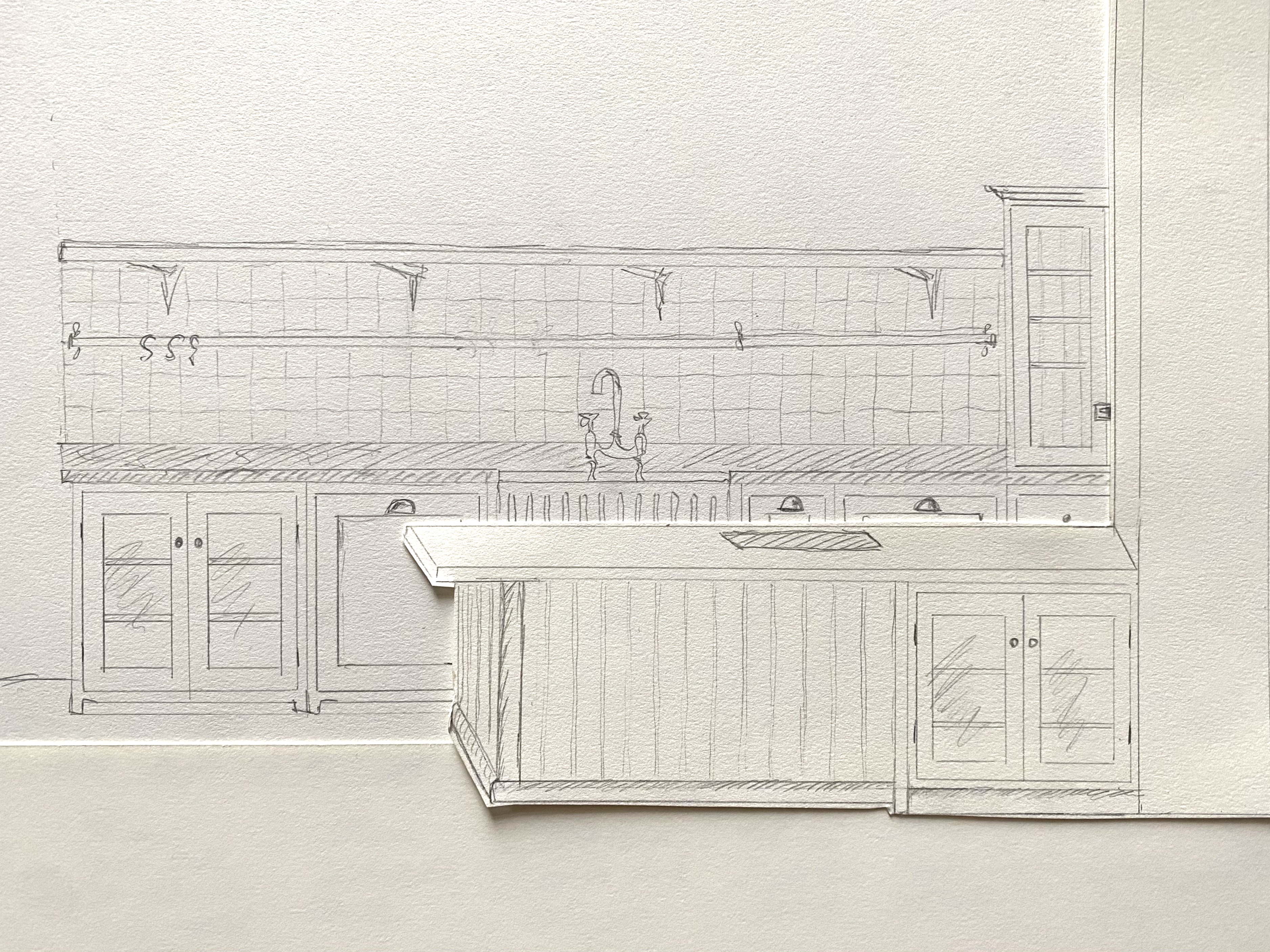
Nora always puts together hand-sketched designs of how they envisage the space, which always sets us off to a great start! They also put a list together of anything that isn’t noted on the drawings, such as any limitations on where appliances can go and if there are parts of the design they’d source locally in Germany, such as the worktops.
I love the open plan style. Do you find this kind of space generally easier to work with when designing a kitchen? Or is it actually harder as you have so much room to play with and you have to consider how it’ll work with the dining and living areas?
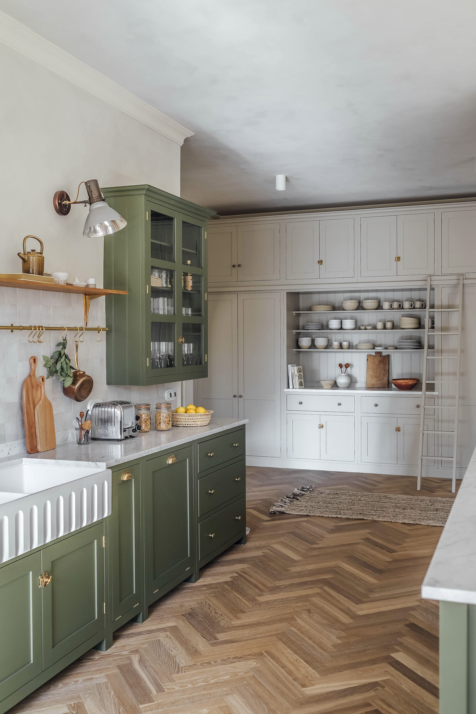
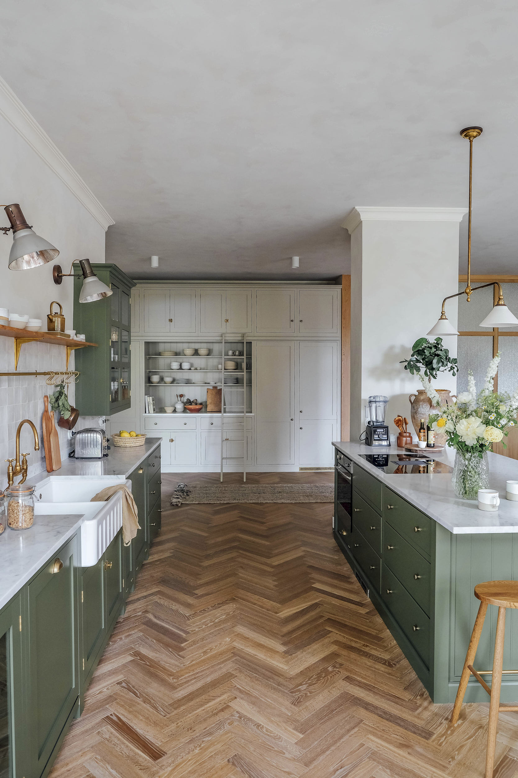
Open plan spaces are often easier to design because you’re not usually as limited on space, especially for an island. I prefer to try and hide appliances away if possible with an open plan room, so the kitchen feels more like pretty ‘furniture’ rather than a typical kitchen. It’s great if the washing machine can go elsewhere, as they can be quite noisy and you may find you are limited on when you can use it. In this design, it’s tucked away in the far corner of the larder run.
As we know, this lovely property is actually a rental apartment. Did this impact the design in any way?
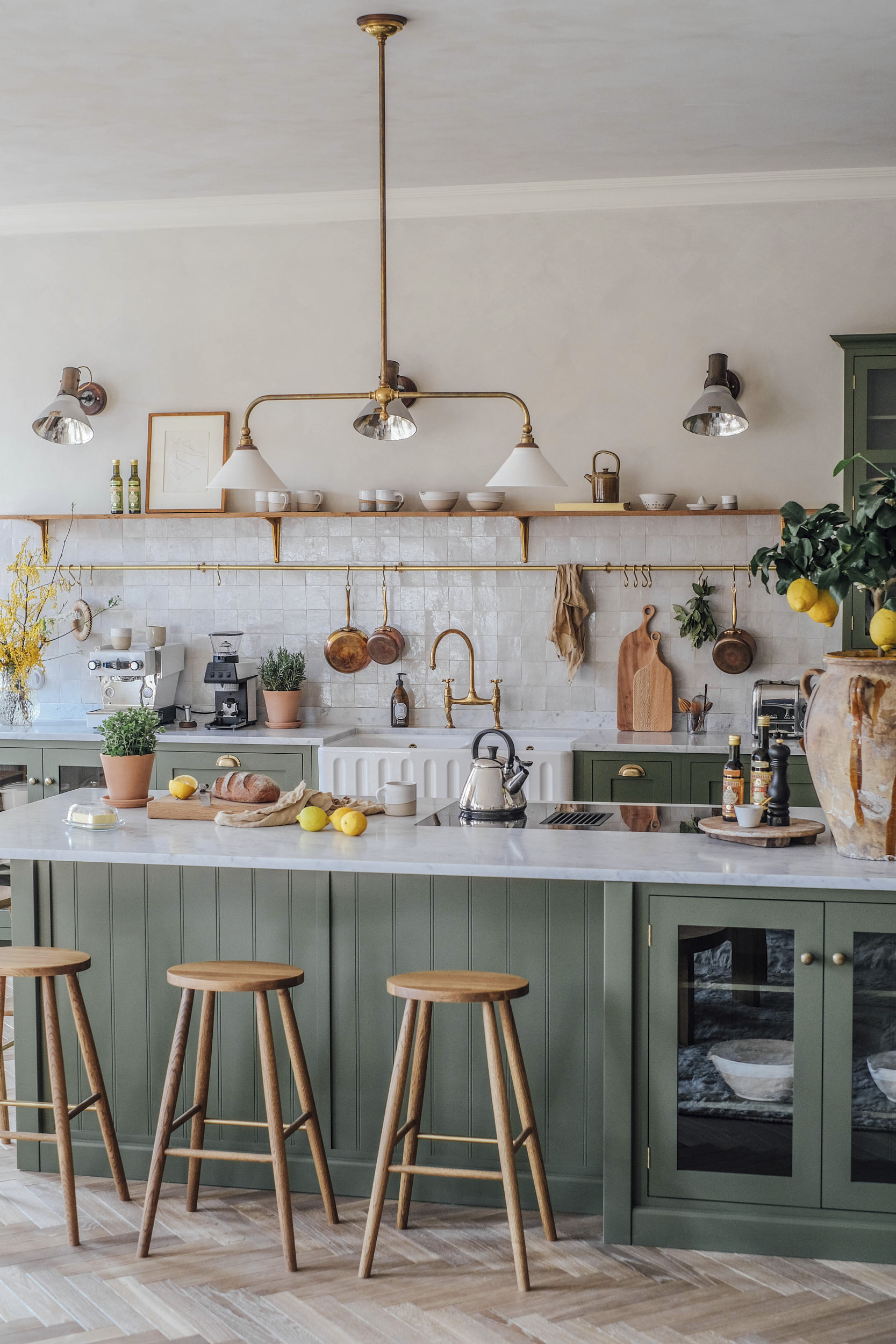
It gives you a little more freedom with the design as you don’t tend to need quite as much storage or space for lots of countertop appliances, like you might have at home. You can also get away with prioritising aesthetics over functionality, which is always much more fun for a designer! We all look for the most beautiful place to stay for your budget when borrowing holiday homes!
And along with being a holiday let, this property is in Kyritz, Germany! Did the process change much with Laura and Nora being outside of the UK?
Usually we start the design process with a visit to the showroom, but as this wasn’t possible for Laura and Nora we communicated via email and it was really easy and enjoyable. We always send over lots of pictures from our huge photo library to help customers visualise the designs we’ve drawn when they aren’t able to see the cupboards in real life. As Laura and Nora had deVOL furniture previously, it helped that they already had a really good idea of the details and finishes available, so we were able to concentrate fully on the layout and accessory choices right from the start.
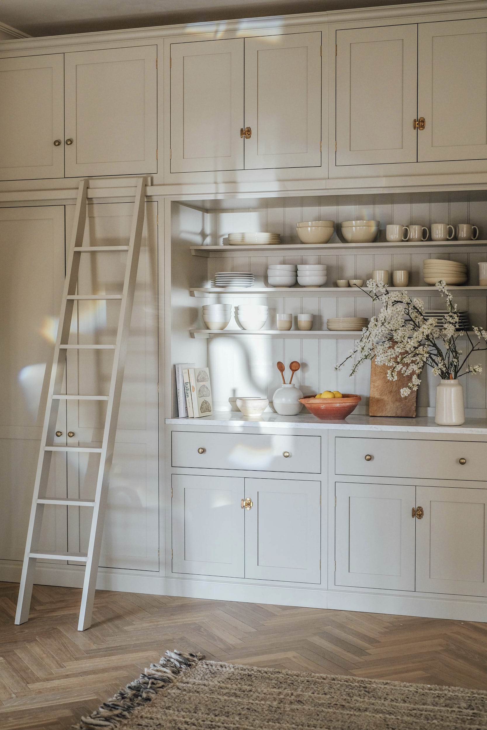
It’s so wonderful to see the new ‘Wilkes Green’ Shaker shade on the cupboards, along with our classic ‘Mushroom’ for the pantry wall. How did Laura and Nora decide the colours and did they always want to use two?
They were really keen to reflect the colours from the oak tree outside the apartment into the design, and so they knew the green shade was going to be super important. They wanted a brighter, leafy green as opposed to the soft, grey-green tones that had become popular recently. ‘Mushroom’ complements this perfectly and keeps the larder area bright and airy, even though it’s furthest from the windows and natural light.
Did Laura and Nora have any absolute deVOL ‘must-haves’ from the start?
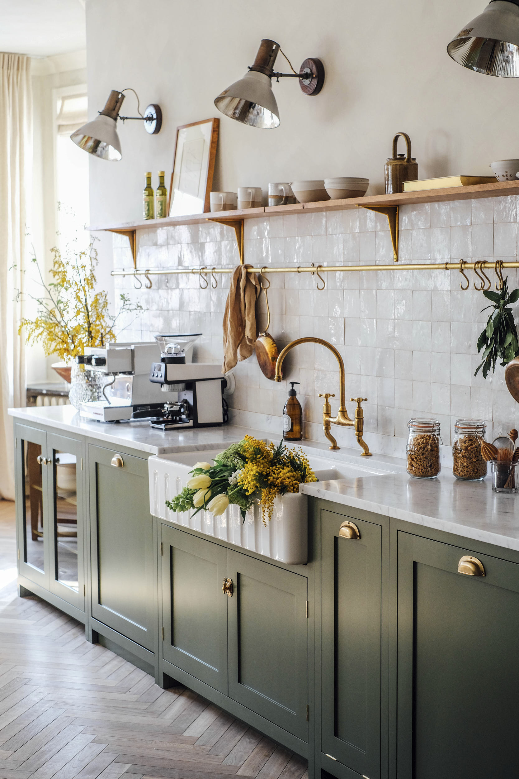
The beautiful double fluted sink was on the must-have list, as well as open shelving to display their collections of handmade pottery, plenty of which is from previous collections made by Claire, deVOL’s ceramics manager. They also love the handcrafted brass accessories, they add plenty of warmth to the design and always look so at home in a historic property.
Final question, last time I did a Q&A with one of our other Senior Kitchen Designers, Alexa, I asked her for her top three tips for designing a beautiful and functional kitchen. I’d love to hear yours too.
Design a layout that will last – don’t get too hung up on the perfect ‘Christmas Day’ kitchen, or on the age of your children at that moment in time. Having something timeless that will work for you every day of the week, as well as for years to come, will mean you’ll always love it!
A great starting point is to create a moodboard to establish the feel you’d like to achieve, giving you a strong direction to refer to throughout the project. It doesn’t have to be anything fancy – I would suggest limiting it to just three images. They don’t necessarily have to be kitchen-related either, it can be made up of colours, textures or images that inspire you… Having a collection of photos showing cupboards, accessories and features you’d like to include alongside the moodboard will be super helpful for your kitchen designer too!
If you’re tight on budget, prioritise the essentials such as perimeter cupboards, appliances and sink and taps. Additional accessories and even islands and freestanding furniture can be added in time. Antique and second-hand pieces can save a lot of money and often look even better than too much matching fitted furniture! You can swap these out in years to come, they don’t lose value and you can move them around to work out what you’d like to invest in later down the line.
– You can find out more about renting this wonderful place on the St Oak Apartments website.
– Take a look at this kitchen on the Shaker Projects page of our website.
– Keep an eye on our Instagram for exciting new projects and updates from us.

